For one of my recent posts I needed to add a customized and dynamic table to a ggplot chart. This can often be helpful to display information in addition to the main idea you are presenting in the plot.
In my example I wanted to show free kick conversion rates by season in a table format. I found this to be far from straightforward so I will try to outlay the main concepts here in case anybody has the same problem.
To make this as engaging as possible I will use an example based on the diamonds data set which comes with the usual R installation. This data set has information on the size, cut, color, prize and some other characteristics of diamonds.
You can follow the steps below by copying the code into your RStudio or R environment.
library(ggplot2)
head(diamonds)
## # A tibble: 6 x 10
##   carat       cut color clarity depth table price     x     y     z
##   <dbl>     <ord> <ord>   <ord> <dbl> <dbl> <int> <dbl> <dbl> <dbl>
## 1  0.23     Ideal     E     SI2  61.5    55   326  3.95  3.98  2.43
## 2  0.21   Premium     E     SI1  59.8    61   326  3.89  3.84  2.31
## 3  0.23      Good     E     VS1  56.9    65   327  4.05  4.07  2.31
## 4  0.29   Premium     I     VS2  62.4    58   334  4.20  4.23  2.63
## 5  0.31      Good     J     SI2  63.3    58   335  4.34  4.35  2.75
## 6  0.24 Very Good     J    VVS2  62.8    57   336  3.94  3.96  2.48
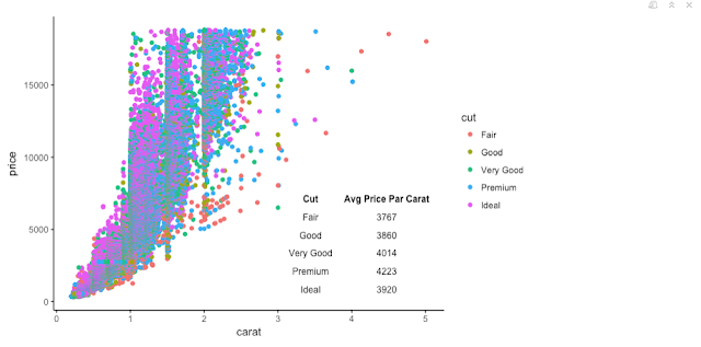
Below we are showing a scatter plot with the weight of the diamonds (measured in carat) on the x-axis and the price on the y-axis.
The data points are also color-coded to provide information on the quality of the cut. If a diamond only has a cut qualified as 'Fair' is has to have larger weight to bring in the same price as a diamond with a 'Ideal' cut.
Let's try to add a table on this chart which shows average price-per-carat for the different diamond cuts. This will give us some nice summary data which will support the information already shown in the plot.
We will first compute the price-per-carat for each diamond to then aggregate over the cut categories.
diamonds$price_par_carat <- diamonds$price / diamonds$carat

price_table <- aggregate(diamonds$price_par_carat,
                         list(Cut=diamonds$cut), mean)
names(price_table)[names(price_table) == 'x'] <- 'Avg Price Par Carat'
price_table$`Avg Price Par Carat` <- round(
  price_table$`Avg Price Par Carat`, digits=0)
show(price_table)
##         Cut Avg Price Par Carat
## 1      Fair                3767
## 2      Good                3860
## 3 Very Good                4014
## 4   Premium                4223
## 5     Ideal                3920
The result is actually a little counter-intuitive. I would have expected the 'Ideal' cut to have the highest price-par-carat. But I am no expert in diamonds so who am I to judge?
Let's try to add this table to the chart. The lower-right corner seems to be an ideal place for some more information.
library(ggplot2)
library(gridExtra)

tt <- ttheme_minimal(
  core = list(fg_params=list(col="black", fontsize=9)),
  colhead = list(fg_params=list(col="black", fontsize=9))
  )

conversion_grob <- tableGrob(price_table, theme = tt, rows=NULL)

ggplot(diamonds, aes(x=carat, y=price, color=cut)) + geom_point() +
  annotation_custom(
    conversion_grob,
    xmin=3.2,
    xmax=5,
    ymin=0,
    ymax=8000)

A few things happen here: we are loading the package *gridExtra*; this package will allow us to use the function *tableGrob* to produce the table object from our price_table data frame.
We then initialize the variable tt which lets us specify some of the formatting options for the table. We are choosing a black font color and a font size of 9 for both the column values and the column headers. You can view further options to format the table by calling vignette('tableGrob') or viewing the documentation.
The ttheme_minimal function loads some default formatting options which are ideal when using with an existing chart (e.g. no background color and no borders). You can find other defaults in the documentation.
The next step is to create the table object from the data frame while also providing our customized theme. We then annotate this table to the plot.
We need to specify the coordinates in which we want the table so sit. You can orientate along the axis legends for these values.
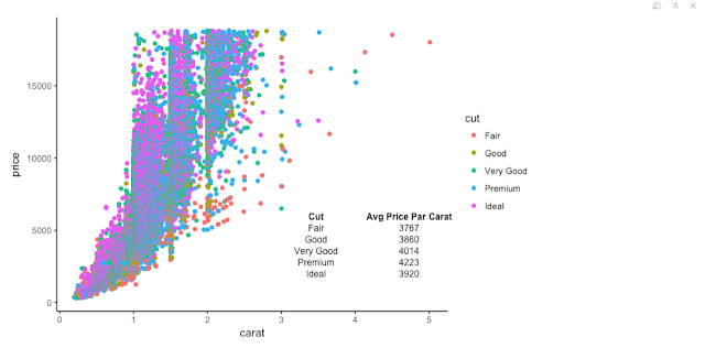
Another formatting option that may come in handy is to specify the table width and height for the tableGrob function. This allows us to save some more space.
The constants 2 and 6 need to match the number of columns and rows respectively or this will throw an error message. The height and width parameters can be found by trial and error.
conversion_grob$widths <- unit(rep(0.7, 2), "npc")
conversion_grob$heights <- unit(rep(0.1, 6), "npc")

ggplot(diamonds, aes(x=carat, y=price, color=cut)) + geom_point() +
  annotation_custom(
    conversion_grob,
    xmin=3.2,
    xmax=5,
    ymin=0,
    ymax=8000)

This is our final output. Please leave a comment below if you have any questions or encounter any problems with this.
If anybody knows more about diamonds please feel free to shed some light on the relationship between price and cut!

Comments
Post a Comment